If you've been building websites for a while, "optimize your images" probably sounds like "eat your veggies." It's good for your website's health, it'll make your SEO big and strong... but compressing every image by hand doesn't sound appetizing to me 🤢
So we're going to talk easy wins for 1) optimizing image file formats and sizes with the picture element, and 2) an automation process using 11ty that you can take with you to your build setup of choice 💪
💁 Intended audience: This is meant for developers building "template-driven" static sites (11ty, Jekyll, Hugo, plain HTML) or "component-driven" web apps (NextJS, Gatsby, etc). If you're working with site builders like Wordpress or Shopify, this probably isn't the article for you!
🥦 So what's wrong with my images right now?
To show what's at stake, here's the lighthouse rating from one of my recent blog posts (images compressed with tinyJPG mind you!)
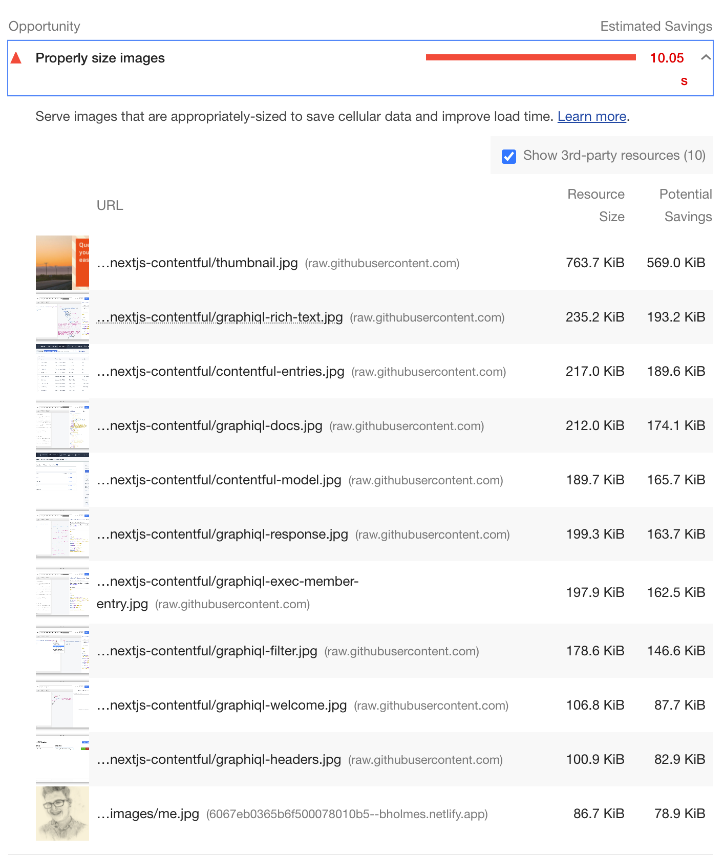
Yikes! 10 seconds to grab all those images? Chromium definitely does some throttling to test on "slower" internet connections, but it's clear those KB rating are quite high (especially for mobile users).
This just to show that there's much more to image optimization than compression! There's also:
- Serving the right format, with JPGs preferrable and
.webpor.aviespecially so - Serving the right size, ideally with multiple copies of the same image at different widths and heights
- Loading at the right time, reaching for "lazy" loading when we can
- Heck, even including
alttext can affect your site from both accessibility and SEO standpoints
I learned a bit about addressing those format and size problems using picture elements, and my lighthouse definitely thanked me for it 😄
Dang, at first my performance on https://t.co/iTZUPe5aBp was getting destroyed by a *ton* of fat JPGs I never condensed down (especially on blog posts). Installed @eleven_ty 's image plugin, put in an hour of work... and just look at it 🤩 pic.twitter.com/l5GLACk8F7
— Ben Holmes (@BHolmesDev) April 5, 2021
🌅 Fixing format + size problems with the picture element
So how can we deliver different image files for the right people? Well, let's start with a humble image element like this one:
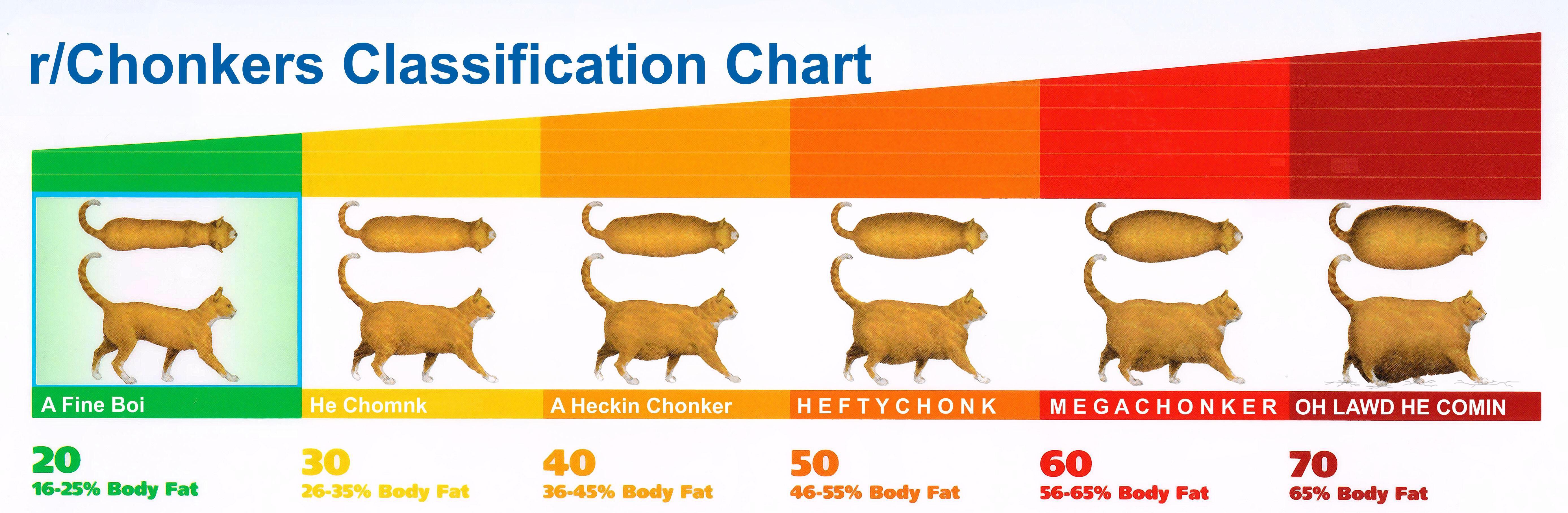
<img src="/assets/mega-chonker.jpg" width="1000" height="600" alt="A perfectly sized cat" />
<details><summary>Chonk level chart</summary>
</details>
Now, say we've opened our image editor and saved a smaller version for mobile users sitting at, say, 600 pixels wide. You could probably set up some CSS to hot-swap your images depending on your screen width:
<img class="desktop" src="/assets/chonker-1000w.jpg"
    width="1000" height="600" alt="A perfectly sized cat" />
<img class="mobile" src="/assets/chonker-600w.jpg"
    width="600" height="300" alt="A perfectly sized cat" />
@media(max-width: 600px) {
  .desktop { display: none; }
}
@media(min-width: 601px) {
  .mobile { display: none }
}
...But this isn't very scalable. What if we're, say, working in a markdown file where we can't append class names? Or we have different formats we want to switch between depending on browser support (JPEG vs WEBP for example)?
This is where the picture element comes in. Take this example here:
<picture>
  <!-- List out all the WEBP images + WEBP sizes we can choose from -->
  <source type="image/webp"
    srcset="/assets/chonker-600w.webp 600w, /assets/chonker-1000w.webp 1000w"
    sizes="100vw">
  <!-- In case a browser doesn't support WEBP, fall back to this set of JPG sources -->
  <source type="image/jpeg"
    srcset="/assets/chonker-600w.jpg 600w, /assets/chonker-1000w.jpg 1000w"
    sizes="100vw">
  <!-- The actual, style-able img element that "receives" these sources -->
  <!-- Also includes a default src in case no <source> can be applied -->
  <img src="/assets/chonker-600.png" alt="A perfectly sized cat" />
</picture>
Some big takeaways:
- We can wrap our image tags in a
pictureto unlock a "switch" case of sorts, with your browser picking the firstsourceelement that it's able to render. But admittedly, most modern browsers will reach for those shiny.webpfiles listed undertype="image/webp"without needing the JPG fallbacks (current browser support here). - Each source has a
srcsetproperty, which takes in a list of source URLs for a given image format. These sources are comma-separated, plus a pixel-value width using thatwon the end. The browser will then decide which source to use based on thesizesproperty (more on that in the next section) - Picture elements are not images themselves! This is an interesting gotcha when you start trying to style those images. So, you'll want to keep putting all your image-specific CSS (ex.
object-fit) on thatimgelement instead of thepicture.
The sizes attribute
Sizes is an interesting beast. It almost looks like CSS actually, with some small syntax differences.
Remember those mobile and desktop helper classes from earlier? Well, sizes let us do something rather similar.
Key takeaways from the video:
In general, the sizes attribute is a way to tell the browser which image to use for a given screen size.
Let's say we have a banner image that takes up the full width of the screen for mobile users, but we have a table of contents that takes up half the width at 500px wide and above.
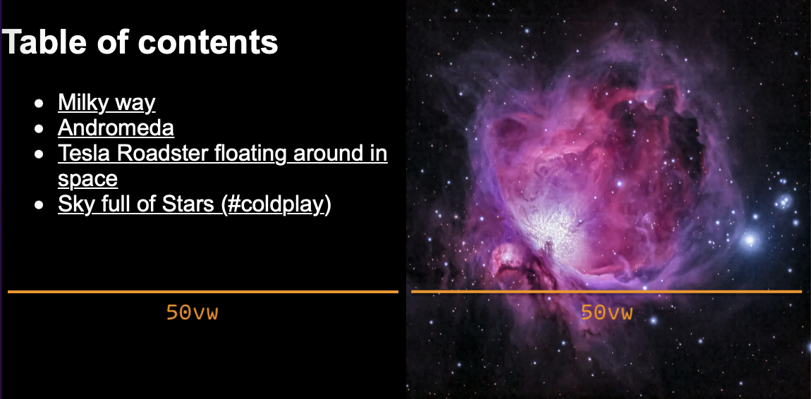
Putting on our CSS hat, this means our image is 100vw (100% screen width) below 500px, and 50vw when we hit @media (min-width: 500px). This perfectly translates to sizes 👉 sizes="(min-width: 500px) 50vw, 100vw"
And in the context of a picture element:
<picture>
  <!--stack up your media queries as sizes, delineated by commas ","-->
  <source type="image/webp"
    srcset="/img/6dfd7ac6-600.webp 600w, /img/6dfd7ac6-900.webp 900w..."
    sizes="(min-width: 500px) 50vw, 100vw">
  <img alt="Blue and purple cluster of stars" src="/img/6dfd7ac6-600.jpeg">
</picture>
As a rule-of-thumb, you should probably use 100vw as a "base case" for smaller devices, and rack up media queries on top depending on how your layout changes. This does mean sizes will be different depending on the context your images are living in, so look out for that if you're using a component-based framework!
Note: You may be wondering why browsers can't do all this work for us. Well, this comes down to the unpredictable nature of "width" when you're throwing around CSS everywhere. If you're like me, you tend to use a lot of percentages like width: 100% for image blocks, which may adjust depending on the container, padding, margins, etc that get applied. If the browser tried to decipher all this styling before loading an image, you'd be waiting a lot longer than you might want!
Respecting HD displays
Note that our screen's pixel density can also affect which image gets picked from a given srcset. For high-density mobile displays, it'll actually choose an image that's roughly double the width you specify! Say we have a simple picture declaration like this for instance:
<picture>
  <source type="image/webp"
    srcset="/img/galaxy-600.webp 600w, /img/galaxy-1200.webp 1200w"
    sizes="100vw">
</picture>
We're using 100vw here, so the browser should match the image source's width to the width of the display. Intuitively, we'd think that a 600px wide display would receive /img/galaxy-600.webp... but for HD displays like Macbooks or modern smartphones, it'll actually reach for an image at 600 x 2 pixels wide (/img/galaxy-1200.webp 1200w in this case). So when you're generating multiple image sizes, always reach for those higher values 💡
🔨 Applying this to your site with 11ty image
Alright, so we see how useful the picture element can be... but it's only as powerful as the pictures we can supply to it. Do we really want to create all those beautifully resized, optimized, multi-format images by hand?
Luckily, there's a lot of tools to handle this process for us, and I'm going to hone in on the simplest I've found: 11ty's image plugin.
🚨 Now before you start scrolling to the next section, no, you don't need to build your site with 11ty to use this. Playing around with this tool, I realized it's perfect for generating optimized images on-the-fly for any use case, no command line prowess required 🔥
Generating optimized images
Let's play along at home! Seriously, drop everything and go open your code editor 🧑💻 Then, make a fresh directory / folder and create a basic package.json. We'll be installing the @11ty/eleventy-img dependency:
mkdir woah-11ty-image-is-cool && cd woah-11ty-image-is-cool
npm init -y # Make a package.json with defaults for everything
npm i @11ty/eleventy-img
Now make a random JavaScript file for us to play with (I'll call mine image-generator.js). Inside, just paste the example code at the top of 11ty's documentation:
const Image = require("@11ty/eleventy-img");

(async () => {
  let url = "https://images.unsplash.com/photo-1608178398319-48f814d0750c";
  let stats = await Image(url, {
    widths: [300]
  });

  console.log(stats);
})();
Hm, this looks pretty straightforward. Let's run it from our terminal and see what happens:
node ./image-generator.js
With any luck, you should see a couple new faces appear:
- A
/imgdirectory with 2 images inside: 1 JPG picture of a galaxy that's 300 pixels wide, and a matchingwebpimage of the same size. Notice how this matches up with ourwidthsarray from the code snippet 👀 - A
/cachedirectory with some strings of characters. Think of this like a note-to-self for the plugin about the image we downloaded. It's expensive to download images off the internet, so to avoid loading it every time we run the script, 11ty checks the cache to see if we've already loaded the image in the past 👍
You'll also see a blob of "stats" logged to your console. Most of these properties are self-explanatory, and some should look familiar from our picture walkthrough earlier on (namely the sourceType and srcset attributes). We even get the output size of the image in bytes, in case you want to inspect the differences between formats and sizes.
But wait, there's more! Let's try experimenting with different widths and formats:
...
let stats = await Image(url, {
  widths: [300, 1000, 1400],
  formats: ['jpg', 'webp', 'gif']
});
...
We should get a plethora of resolutions inside that img directory. As you can imagine, this is perfect for our picture element from earlier. You can whip up all the sources and size attributes by hand as a learning exercise...
Automating our picture elements
...Or let the plugin do this for us! Along with that handy array of stats, 11ty image will splice everything into a valid <picture> element. All we need is a call to the generateHTML helper:
const Image = require("@11ty/eleventy-img");

(async () => {
  let url = "https://images.unsplash.com/photo-1608178398319-48f814d0750c";
  let stats = await Image(url, {
    widths: [300, 1000, 1400]
  });
  const html = Image.generateHTML(stats, {
  	alt: "A blue and purple galaxy of stars", // alt text is required!
	sizes: "100vw" // remember our training with "sizes" from earlier...
  })

  console.log(html);
})();
With any luck, we should see a beautiful picture we can use anywhere on our site:
<picture>
	<source type="image/webp"
          srcset="/img/6dfd7ac6-300.webp 300w, /img/6dfd7ac6-1000.webp 1000w,
                  /img/6dfd7ac6-1400.webp 1400w"
          sizes="100vw">
	<source type="image/jpeg"
          srcset="/img/6dfd7ac6-300.jpeg 300w, /img/6dfd7ac6-1000.jpeg 1000w,
                  /img/6dfd7ac6-1400.jpeg 1400w"
          sizes="100vw">
	<img alt="A blue and purple galaxy of stars" src="/img/6dfd7ac6-300.jpeg" width="1400" height="1402">
</picture>
Going further
This plugin has a whole host of extra options to explore too, like
- messing with cache options for faster build times
- generating image stats + picture elements synchronously, so you don't have wait for the images to actually get generated
- fine-tuning the Sharp image processor to tweak the output to your needs
📣 Using 11ty image with any framework
If all this <picture> madness excites you, go throw this 11ty image plugin at your own /assets directory! I wrote this handy little script to crawl all the images in a directory (not recursively mind you) and spit out some optimized files:
const Image = require('@11ty/eleventy-img')
const { readdir } = require('fs/promises') // node helper for reading folders
const { parse } = require('path') // node helper for grabbing file names

;(async () => {
  const imageDir = './images' // match this to your assets directory
  const files = await readdir(imageDir)
  for (const file of files) {
    const stats = await Image(imageDir + '/' + file, {
      widths: [600, 1000, 1400], // edit to your heart's content
      filenameFormat: (id, src, width, format) => {
        // make the filename something we can recognize.
        // In this case, it's just:
        // [original file name] - [image width] . [file format]
        return `${parse(file).name}-${width}.${format}`
      },
    })
    console.log(stats) // remove this if you don't want the logs
  }
})()
If you happen to use 11ty on your personal site (or at least want to try), you can automate the picture element insertion as well. Their guide covers building your own "shortcode" function to insert the right picture for every unoptimized image on your site.
Even without this luxury though, this script is a great addition to any JS-based build step. Here's a basic Image component I could slap into any React app based on that script above:
// consider using TypeScript for checking all these props!
const Image = ({ fileName, sizes, ...imageProps }) => (
	<picture>
	  <source
		type="image/webp"
		srcSet={`/img/${fileName}-600.webp 600w, /img/${fileName}-1000.webp 1000w, /img/${fileName}-1400.webp 1400w`}
		sizes={sizes}
	  />
	  <source
		type="image/jpeg"
		srcSet={`/img/${fileName}-600.jpeg 600w, /img/${fileName}-1000.jpeg 1000w, /img/${fileName}-1400.jpeg 1400w`}
		sizes={sizes}
	  />
	  <img src={`/img/${fileName}-600.jpeg`} {...imageProps} />
	</picture>
)
Assuming all my images get generated with this file naming convention (and I always have images at 600, 1000, and 1400 widths), this should pull all our optimized images no problem 👍
Here's a brief rundown on applying these learnings to create-react-app:
Go try it yourself
You can check out a running example of create-react-app + 11ty image in this CodeSandbox 🪄
This version will listen for new images during development as well. Feel free to fork the source code to try in your own project (and find the edge cases I inevitably missed 😉).
Other options for Next, Nuxt, Gatsby and more
As cool as 11ty image can be, I should definitely highlight some "native" options for popular meta-frameworks:
- For Next, their built-in Image component is perfect. They'll also cover our sizes, formats, and image compression automatically, plus some neat props for eagerly loading images that are "above the fold" using
priority. - For Nuxt, their
<nuxt-img>and<nuxt-picture>components should have you covered. These offer most of the same benefits as our 11ty image plugin, letting you specify different formats, asizesattribute, and background image compression. Just be sure to usenuxt-pictureif you want to allow multiple image formats instead of just one! - For Gatsby, you've got the gold standard of image optimization 🏆 Their image plugin was actually my main reason for using the framework a few years back, and it's only gotten better. The nicest feature (beyond matching everything we've talked about) is their loading animations for images. You can fade in over vector traces of an image, use a blur effect, and a lot more. The only downside is the hefty JS bundle it loads into the browser to pull this off, which I've given my opinions on over here.
- Beyond the framework, you can optimize remotely using something like Cloudinary. This is a great option if you don't own the build process for your website, or don't want to store your images inside your code repository. For example, you can point all your Wordpress images to a cloudinary bucket and pull different image widths and formats for there. The only downside is the cost, since Cloudinary is doing all this image processing and storage for you.